Assista X vs a General AI Chatbot
When you ask a general AI chatbot about your business numbers, you get a text response. Maybe a markdown table. That's it.
Assista X is different. When you ask about your Odoo data, it pulls real live data from your Odoo system and renders interactive charts inline — right inside the chat. You can hover over data points, switch chart types, change colors, and download the chart as an image, all without leaving the conversation.
| Feature | General AI Chatbot | Assista X |
|---|---|---|
| Data source | Trained knowledge (may be outdated) | Live data fetched from your Odoo in real time |
| Charts | Static images (if any) | Interactive charts inside the chat |
| Chart customization | None | Type, color, highlights, thresholds |
| Export | Copy text | Download as PNG |
Available Chart Types
Assista X supports 6 chart types. The agent automatically picks the most appropriate one based on your data, but you can always switch it yourself.
| Chart Type | Best Used For |
|---|---|
| Bar | Comparing values across categories (e.g. revenue by customer) |
| Line | Showing trends over time (e.g. monthly sales) |
| Area | Trends with volume emphasis (e.g. cumulative revenue growth) |
| Pie | Showing proportions of a whole (e.g. product category share) |
| Donut | Same as Pie, with a cleaner look |
| Scatter | Spotting correlations between two values |
Opening the Full Chart View
Every chart in the chat has an expand icon in the top-right corner. Click it to open the full chart view where all controls are available.
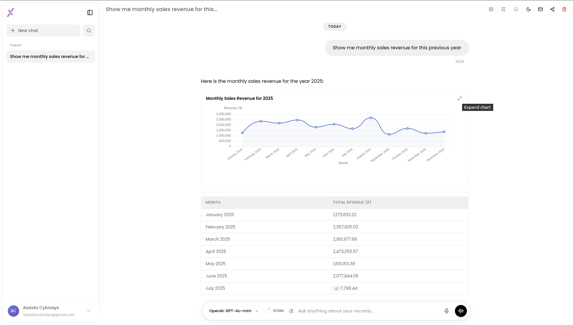
Click the expand icon to open the full interactive chart view
Customizing Your Chart
Switching the Chart Type
In the expanded view, click any type in the Chart Type selector to instantly switch the visualization. The data stays the same — only the display changes.
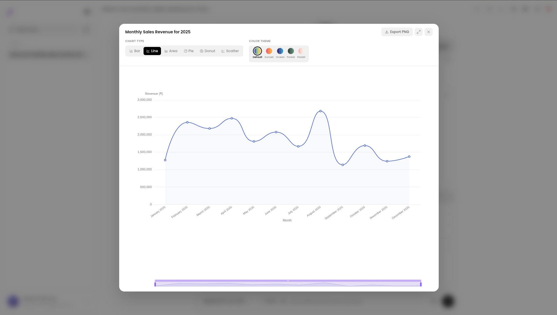
Switch between Bar, Line, Area, Pie, Donut, and Scatter with one click
For example, switching from a bar chart to a line chart shifts the focus from comparison to trend — useful when you want to see how a metric moves over time rather than how values stack up against each other.
Changing the Color Palette
Below the chart type selector you'll find the color palette picker — five swatches that repaint the entire chart instantly.
| Palette | Feel |
|---|---|
| Default | Balanced, multi-color — good for most charts |
| Sunset | Warm reds and oranges — strong contrast |
| Ocean | Cool blues — clean, professional look |
| Forest | Deep greens — earthy, easy on the eyes |
| Pastel | Soft tones — lighter, presentation-friendly |
Click any swatch and the chart updates immediately — no reload, no rerender delay.
Five palettes to match your brand or preference
Zooming Into a Range
For bar and line charts with many data points, a range slider appears at the bottom of the chart inside the expanded view. Drag either end of the slider to narrow the visible range and zoom into a specific period or category.
This is especially useful when you're looking at a full year of monthly data but want to focus on a single quarter — just drag the slider handles to frame the range you need.
Drag the slider to zoom into any section of the chart
Downloading the Chart
Want to share or save your chart? Click the Download button in the expanded view to export it as a high-resolution PNG image.
The downloaded image captures the chart exactly as it appears on screen — including your chosen chart type, color palette, and the current zoom range.
Export any chart as a PNG with one click
Try It Yourself
Not sure what to ask? Here are some example questions you can type directly into the chat to generate charts from your Odoo data.
Sales & Revenue
- "Show me monthly revenue for the past 12 months as a line chart"
- "Which are my top 10 customers by total sales this year?"
- "Compare sales performance across my sales team this quarter"
Inventory
- "Show product stock levels by category as a bar chart"
- "Which products have the lowest stock right now?"
Finance
- "Break down my expenses by account type for this month as a pie chart"
- "Show accounts receivable aging as a bar chart"
HR & Payroll
- "How many employees joined each month this year?"
- "Show payroll cost by department for the last 6 months"