What Is Chart Enrichment?
Chart enrichment is a layer of intelligence Assista X adds on top of your data charts. Instead of just showing raw bars or lines, the agent can overlay:
- A trend line — to show the overall direction of your data
- A moving average — to smooth out noise and reveal the underlying pattern
- A forecast — to predict the next value based on your historical data
- Limit lines — horizontal reference lines that mark targets or thresholds, with bars automatically colored to show what's above or below
These overlays are drawn directly on the chart. You don't need to set them up — the agent decides when they're useful and adds them automatically.
Important: Enrichment overlays only appear on time-series charts — charts where the x-axis represents dates or time periods (months, quarters, weeks, etc.). They work on Bar, Line, and Area chart types. Pie, Donut, and Scatter charts never show overlays.
Overlays Are Only Visible in the Expanded View
Enrichment overlays and their controls are not visible on the chart card in the chat. To see them, you must expand the chart first.
Click the expand icon in the top-right corner of any chart card to open the full chart view. Once expanded, if the chart supports enrichment you'll see the Overlays panel with toggle buttons for Trend Line, Moving Average, and Forecast.
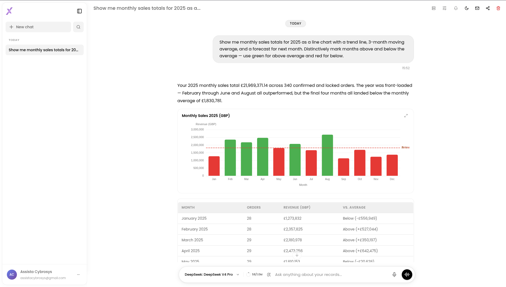
Click expand — overlays and all controls are only available in the full view
How to Enable Chart Enrichment
Chart enrichment is controlled by a per-session toggle in the session settings panel.
- Open any chat session
- Click the session settings icon in the top-right area of the navbar
- Turn on Charts & Overlays
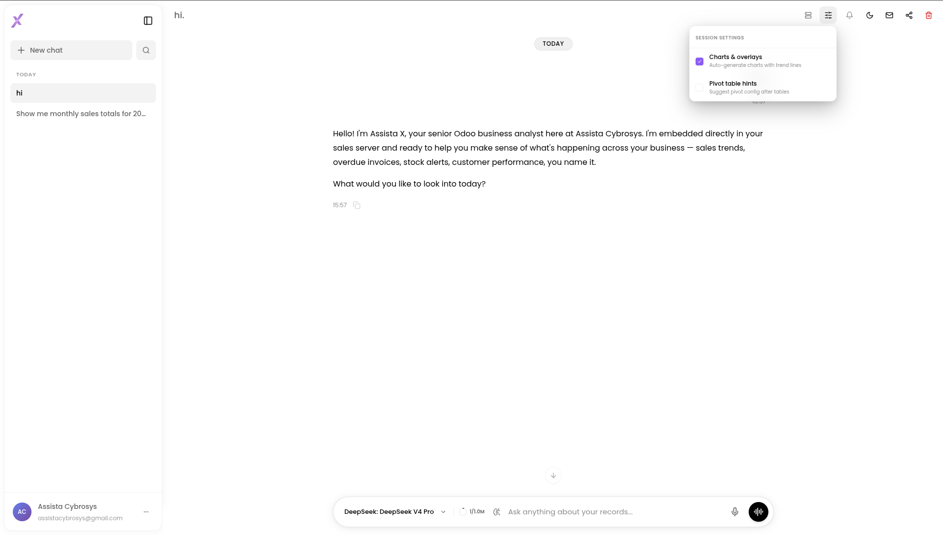
Enable Charts & Overlays to let the agent add enrichment layers to your charts
Once enabled, when you ask questions about time-based data the agent will include enrichment overlays wherever they add value — such as monthly sales trends, quarterly comparisons, or revenue growth over time.
The Three Overlay Types
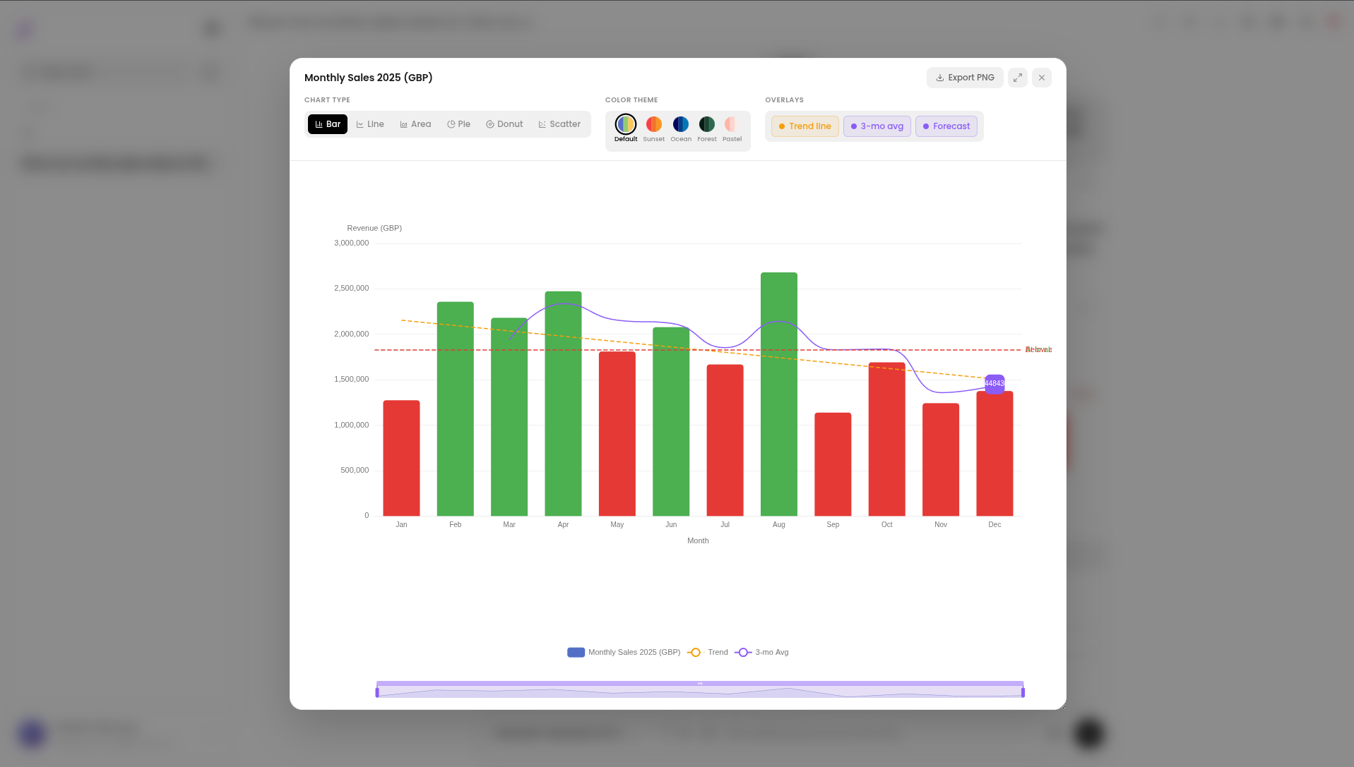
Open an enriched chart in the expanded view and you'll find the Overlays panel with three toggle buttons. Each can be turned on or off independently.
Trend Line
Color: Amber dashed line
The trend line is drawn using linear regression across all your data points. It shows the overall direction — is this metric growing, declining, or flat?
Use it when you want to cut through the noise of month-to-month variation and see the bigger picture at a glance. For example, even if some months dipped, the trend line makes it immediately clear whether revenue is growing overall.
The amber dashed line shows the overall direction of the data
Moving Average
Color: Purple line
The moving average smooths your data by averaging each point with its neighbors (default: 3-period window). This removes short-term spikes and dips so you can see the true underlying pattern.
Use it when your data is noisy — for example, weekly sales that jump up and down due to promotions. The moving average reveals the steady baseline beneath the volatility.
The purple line smooths out noise to reveal the true trend
Forecast
Color: Purple point with label
The forecast extends your chart one step beyond your actual data, predicting the next value based on the trend in your historical data. It appears as a single labeled point at the far right of the chart.
Use it for a quick directional estimate — "if things continue as they are, what's next month likely to look like?" It's an indicator, not a guarantee, but it gives you a starting point for planning.
The forecast point predicts the next value based on your historical trend
Limit Lines and Threshold Coloring
Limit lines are horizontal dashed reference lines drawn across the chart at a specific value — like a sales target, a budget cap, or a minimum stock level. The agent adds these automatically when your question involves a target or threshold.
When a limit line is set, the chart also colors the bars automatically:
- Bars above the threshold get one color (e.g. green — target met)
- Bars below the threshold get another color (e.g. red — target missed)
This makes it instantly obvious which entries are performing and which are not — no scanning numbers required.
Example: Ask "Show me sales by rep vs a target of $10,000" and Assista X draws a horizontal dashed line at $10,000, colors reps who hit the target green, and reps who missed it red.
Dashed limit line with automatic bar coloring — green above target, red below
Note: Limit lines work on any bar or line chart — they don't require the x-axis to be time-based.
Toggling Overlays On and Off
In the expanded chart view, click any button in the Overlays panel to show or hide that overlay. The chart updates instantly.
This lets you compare the raw data against the smoothed view, or present a clean chart without overlays when sharing with someone who just needs the numbers.
Try It Yourself
These questions are designed to produce enriched time-series charts with overlays and limit lines.
Trend & Growth
- "Show me monthly sales for the past year with trend line"
- "Plot revenue by month for the last 6 months and show the moving average"
- "Show me cumulative revenue growth this year as an area chart"
Targets & Limit Lines
- "Show sales by sales rep compared to a $15,000 monthly target"
- "Which products have stock below 50 units? Show as a bar chart"
- "Show expense by department vs a budget of $20,000"
Forecasting
- "Based on the last 6 months, what is next month's expected revenue?"
- "Show me headcount growth over the past year and forecast the next month"